3. Create accessible web content
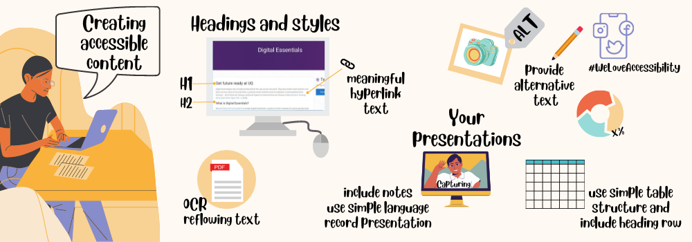
Web content should be accessible to all users, regardless of their circumstances. Content is considered accessible when it can be easily accessed, used, and understood by all users.

This section focuses on webpages, followed by sections that look at social media, documents and presentations.
Plain language
Use plain language when you write online content. Plain language is concise, well structured and easy to understand. If you use common terms and simple sentences it will be quicker for your users to read your content.
Simple words and phrases
Use common, everyday words so that your audience doesn’t have to work hard to understand your content. Use terms consistently. Explain technical terms and avoid jargon slang and idioms.
Examples of simple words:
- get rather than “obtain”
- because rather than “as a consequence of”
The Everyday words cheat sheet is a list of words to avoid and alternatives to use instead.
Active voice
Use active voice rather than passive voice, whenever possible. Using active voice clarifies the doer of the action and typically enables you to convey the same message with fewer words.
Example: Submit the form to apply rather than “The application must be submitted using the form.”
 Easy to read or not?
Headings
Use headings and subheadings to divide your content into smaller chunks that are easier to scan.
Use heading styles in the correct order. Heading titles should be concise and accurately describe the page, section or paragraph. Don’t skip heading levels, as this will affect the accessibility of your content.
 Adding headings
Links
Use descriptive links. Avoid using non-descriptive links like ‘Click here.’ Inform your users about the anticipated outcome when clicking the link. For instance, use descriptive text such as ‘Templates, checklists, and tips for web writing’ to convey the purpose and value of the link.
If you link to a video, PDF, document or some other format, describe what it is in the link text. It is also good to indicate the length of the video or the file size e.g.
- Why chunking content is important (YouTube, 2m10s)
- Template for web writer’s planning notes (PDF, 57KB)
Images
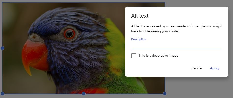
Write informative alternative text (alt text) for any images that are not just decorative. All users should have equitable access to information contained in images. If the information is not in the surrounding text, it must be in the alt text. When deciding whether an image is decorative or informative, consider why you decided to include it in your content.
Writing alt text
The alt text should be simple and as short as possible. Most web platforms will have an alt text field for images.
- If you are writing HTML code, add alt=”description of the image“ within the image tag.
- Images that have no function or are purely decorative should still have an empty alt attribute in this format alt=” “. This tells screen readers to skip this image.
- Many platforms require you to enter a space in the alternative text field to produce alt=” ” in the source code.

Long descriptions
Try not to put text instructions in an image. If you can’t avoid having an image containing complex instructions or content, provide a long description. You can add a link to a long description.
Sighted users can use visual cues to make sense of tables but screen reader users need the correct HTML markup to understand the data. Creating Accessible Tables explains why HTML markup is so important.
- Add column and row headers. Table headers should never be empty.
- Use the scope attribute to associate the data cells with the headers.
- A table caption can also be helpful.
Video and audio
Video used in your web content should have captions and a transcript. The audio for the video should fully describe the visual content. If it doesn’t, an audio description would be required. Audio descriptions provide information about the visual content. Find out more about using captions, transcripts and audio descriptions.
If you make a video, plan your script so that you fully explain any visual content. YouTube provides captions and transcripts for videos that have spoken audio.
Audio-only content, such as a podcast, should have a transcript.
The Types of Assignments module has tips on creating video and audio.
Colour contrast
When planning your overall design scheme, check the colour contrast of text on backgrounds. Poor colour contrast can be difficult for people who are colourblind.
Web accessibility checker
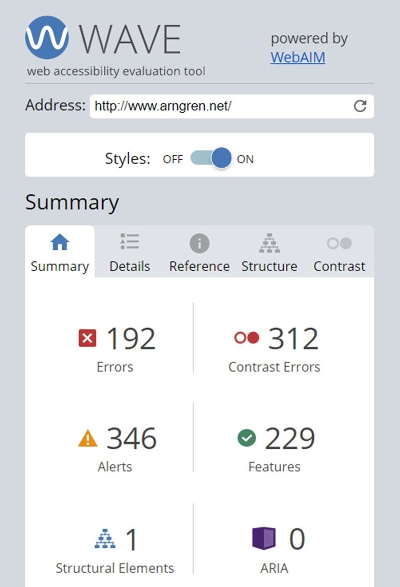
WAVE Web Accessibility Evaluation Tool – WAVE® is a suite of evaluation tools that searches websites for problems in the code that can affect appearance and usability of the website.
 Check your knowledge
Let’s revisit Arngren.net from the What is accessibility? section of this module.

![]() Check a website that you visit regularly with the WAVE tool. What can you tell about its accessibility using WAVE?
Check a website that you visit regularly with the WAVE tool. What can you tell about its accessibility using WAVE?
Find out more about creating accessible web content:
- Accessibility for web writers from 4 Syllables
- Testing web content for accessibility
- Teach Access tutorial from Teach Access


